Multi Hero Products Teaser

Description


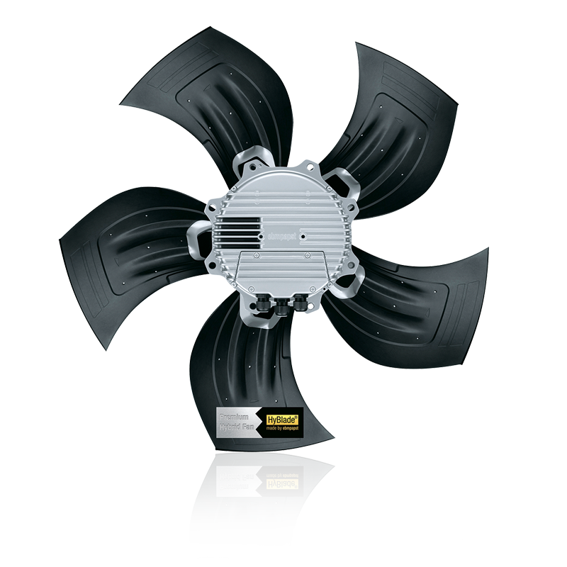
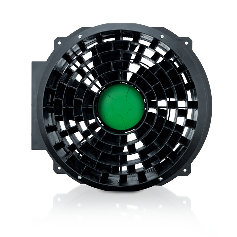
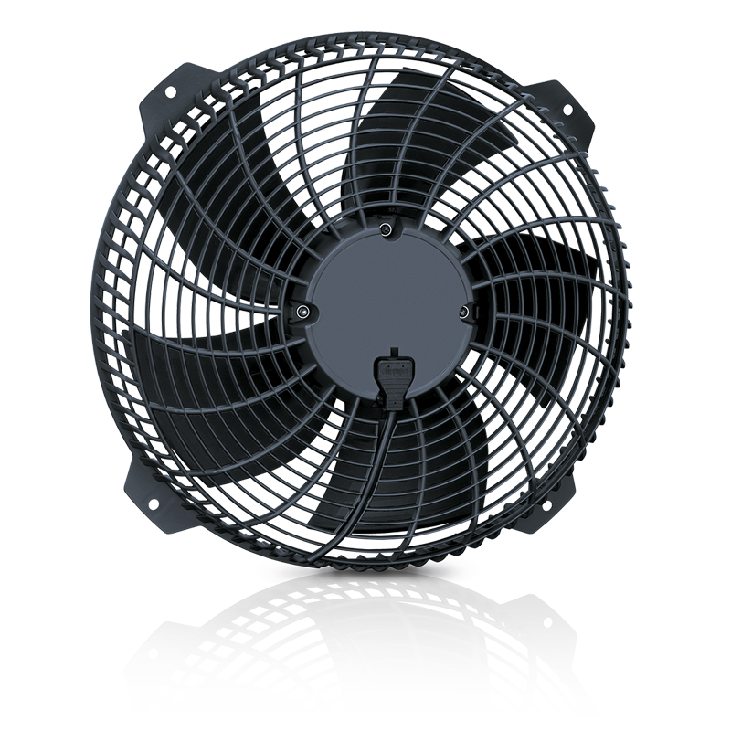
The Multi Hero Products Teaser is a component to show  2 - 4 products or product categories that could be interesting for the user in a prominent way.

For more products, another teaser component (e.g. Hero Product Swiper) should be used.

An optional headline for the component section can be added (currently not working appropriate).

Each entry also provides a link to corresponding page.

This Component spans over the whole width of the page. It equally splits the width for every entry depending on entry count.

Usage


The Multi Hero Products Teaser can be used:

  • On Home
  • On Campaign pages
  • On Product overview pages

Component Content

  • This Component spans over the whole width of the page. It equally splits the width for every entry depending on entry count. There should be at least 2 entries and max 4 entries.
  • An optional headline can be entered which is shown in a light gray area above the entries.
  • Each entry consists out of:
    • Light background-color
    • Headline with link indicator (internal, external)
    • Short text
    • Productshot or Image
    • Hover animation

Demonstration (see below)

How to build a Multi Hero Product Teaser

Multi Hero Product Teaser Headline (Details)


In the edit mode, drag and drop the Overview Teaser Component from the Components list. Double click on the dropped component to start editing.

❶ "Teaser Title":(Optional) so, if necessary enter a  text for the headline. This text can be refined with some properties like "Bold", "Italic", "Superscript", ...

Multi Hero Product Teaser Content (Details)

❷ Tab "Teaser Entry": It allows you to enter the various parameters of this teaser (title, text, image link).

❸ Teaser Description: The title of this teaser.

❹ Teaser Short Text: The text of the teaser. Can contain upto 512 characters but it is strongly recommended to limit the length of this text to about 150 characters.

❺ Teaser Image: Enter the path of the image that needs to be displayed.

❻ Internal or External Teaser Linkpath: The target (page internal or external) link has to be set by the user. The link indicator (internal, external) will be set automatically.

❼ If you wish to add a new element, click on "Add" and repeat steps 3 to 6.